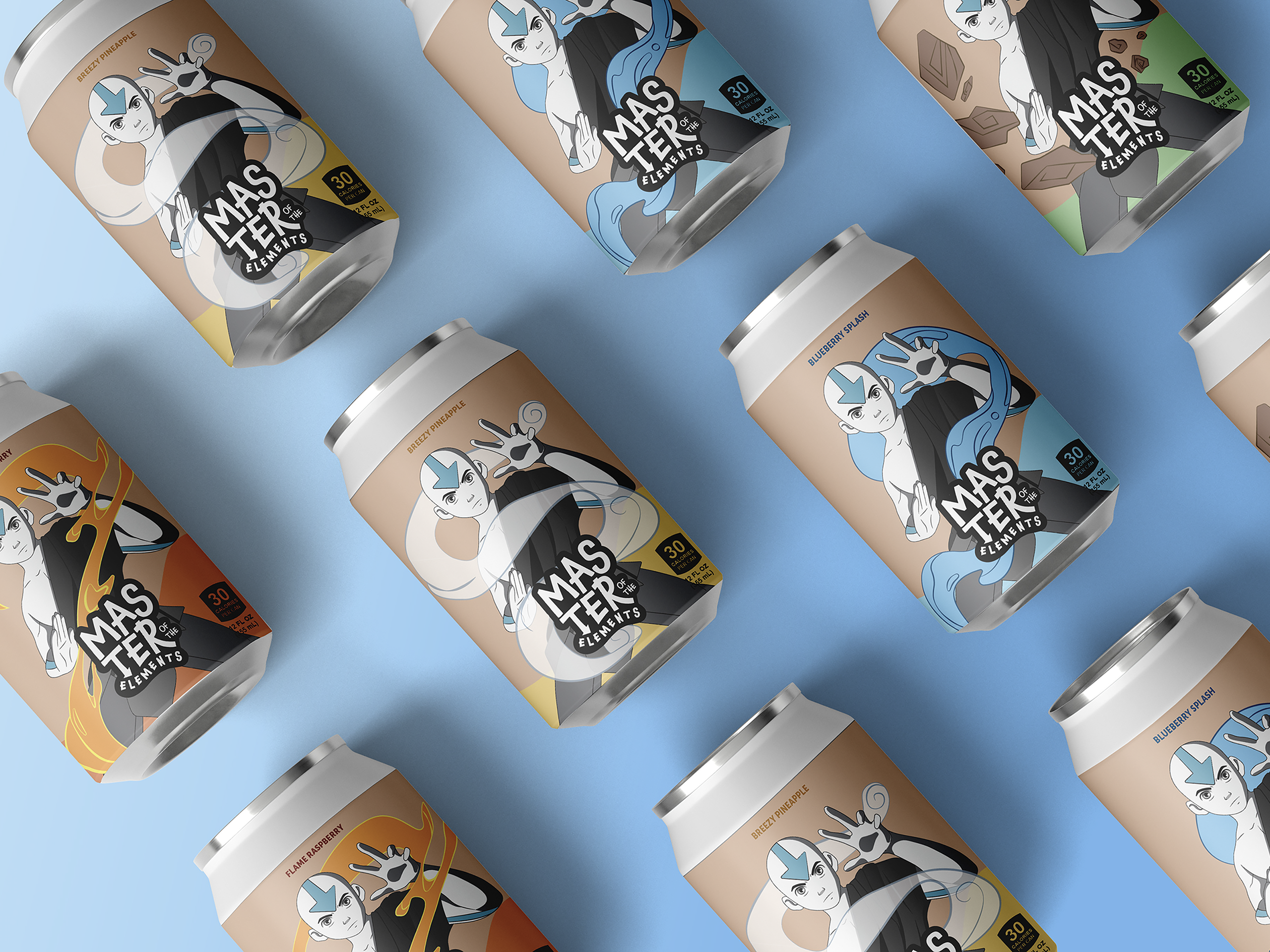
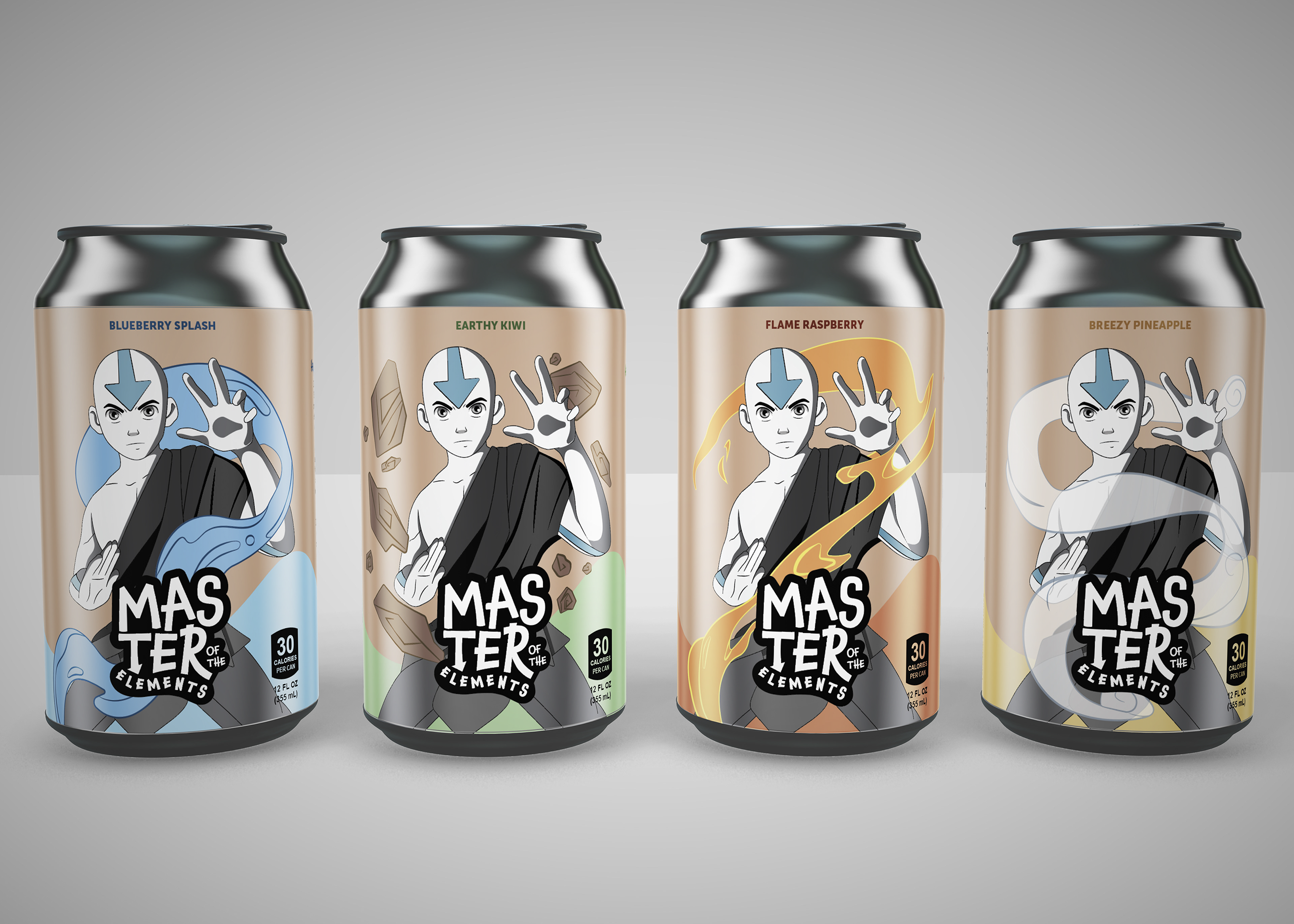
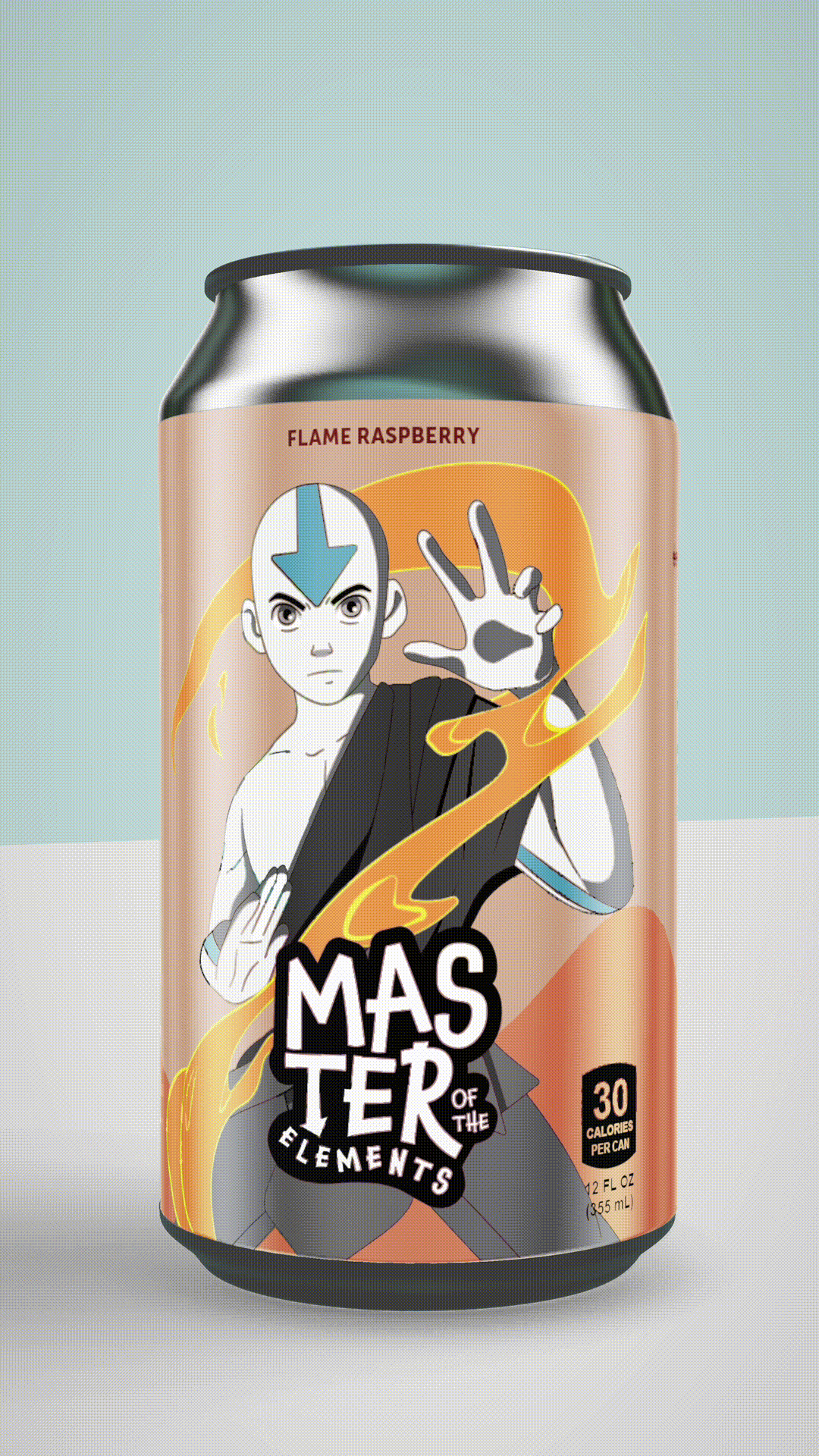
This elemental selection of juices is the ultimate embodiment of balance and harmony. The juices include the elemental essence of the Water Tribe’s Blueberry Splash Juice, the grounded strength of the Earth Kingdom’s Earthy Kiwi Juice, the fiery power of the Fire Nation’s Flame Raspberry Juice, and the airy freedom of the Air Nomads’ Breezy Pineapple Juice.
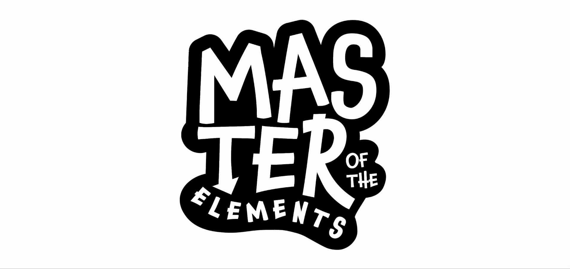
About the logo
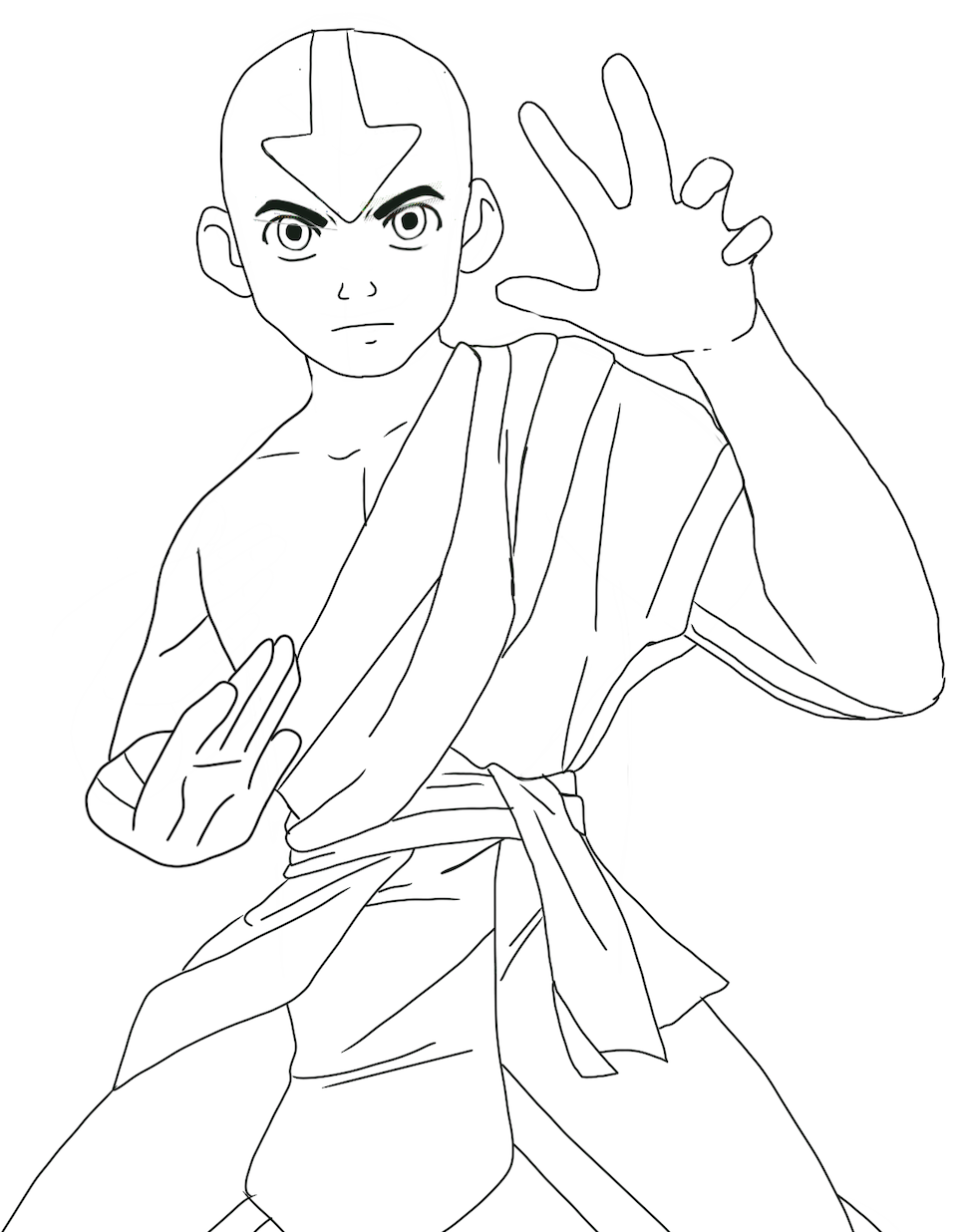
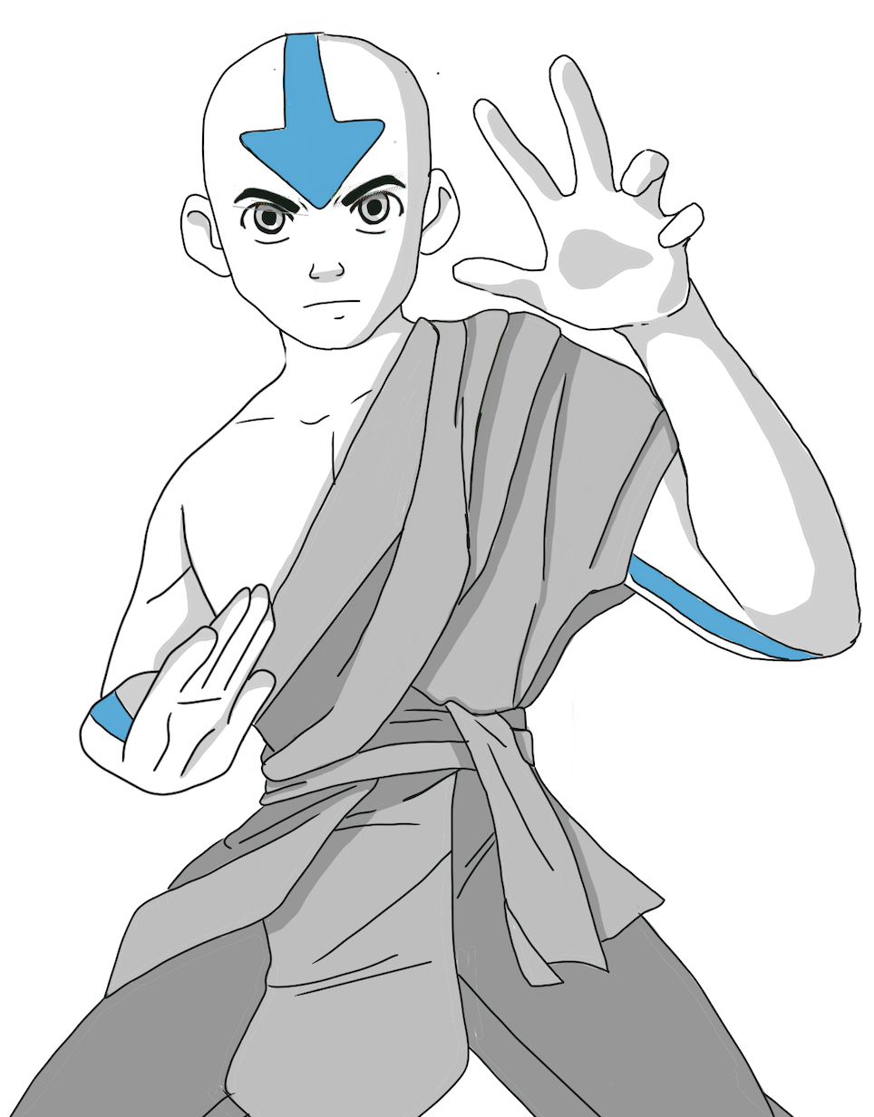
The logo needed to be fun and dynamic to represent the identity of the brand. That look was achieved by using a dynamic font to start and then modifying it to have details like an arrow and a playful movement for the word “elements.”
PANTONE 2975 C
CMYK
RGB
37250
153214234
#99D6EA
PANTONE 13-0116 TPX
CMYK
RGB
314360
180211178
#B4D3B2
PANTONE 7576 C
CMYK
RGB
1255781
21913478
#DB864E
PANTONE 7403 C
CMYK
RGB
713570
238212136
#EED484
PANTONE 7590 C
CMYK
RGB
1728360
212181158
#D4B59E
PANTONE 7692 C
#005587
PANTONE 7743 C
#44693D
PANTONE 1815 C
#7C2529
PANTONE 7511 C
#B77729
PANTONE 462 C
#5C462B
Colors and Typography
The chosen colors represent each element: blue represents water, green earth, red fire, and yellow air. These colors are very different; for that reason, it was decided to use less saturated tones so that all colors could work as wished.
The chosen fonts are fun and dynamic. Museo Sans is legible yet has a friendly look. Chaloops is very playful and perfectly represents the movement and dynamism of the elements.
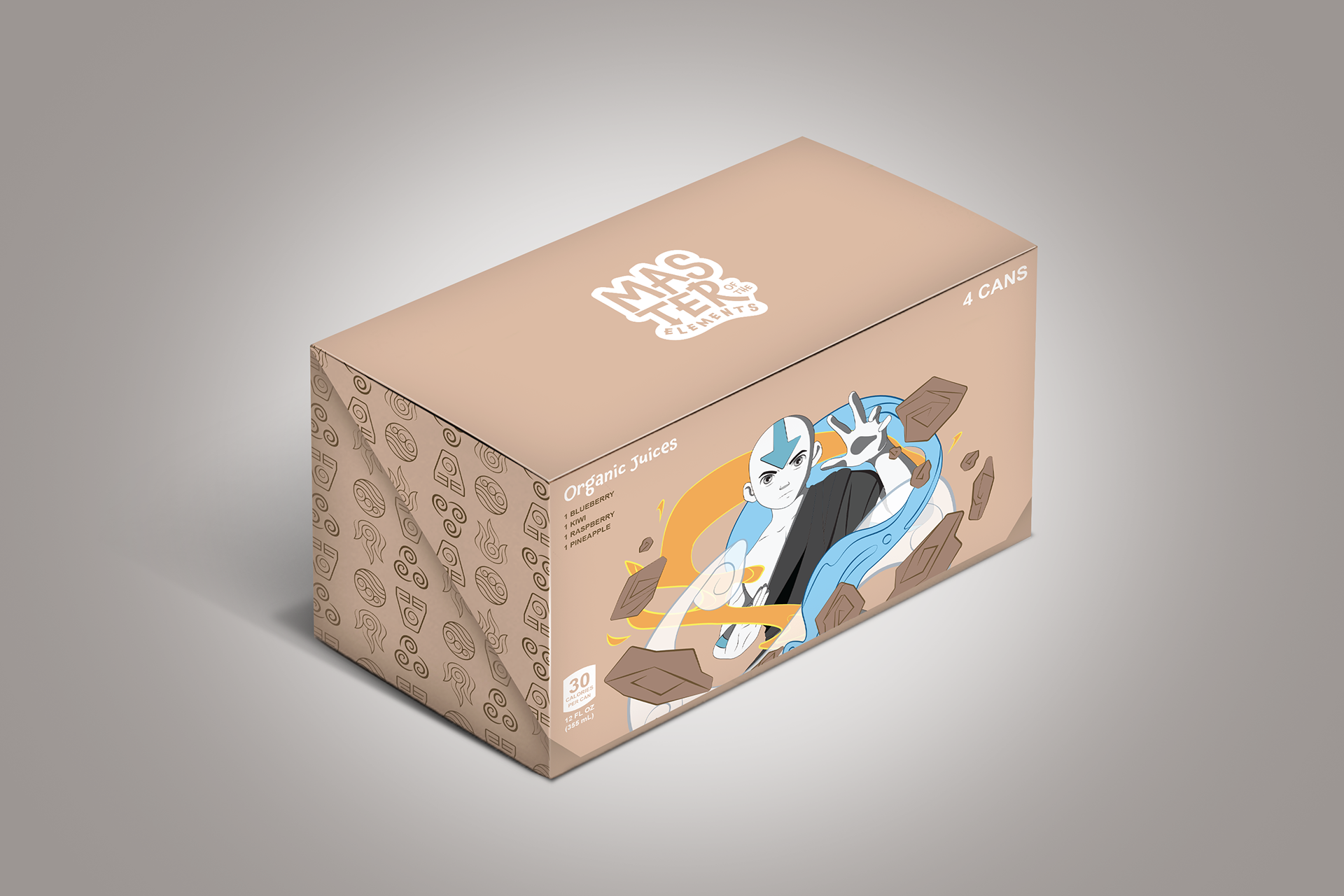
Packaging Design
The box design represents the combination of the four elements. With the calming, brown color, it welcomes the buyer and invites them not only to try all the flavors but also to become part of the story.