Eastern USA Pizza Republic is a restaurant that makes classical brick oven pizzas. The idea for this project was to create a modern logo yet keep that classical rustic vibe the restaurant is known for.
Logo Design
The main vertical logo was created using a variety of sizes in the text, emphasizing the USA part of the name while also giving the other parts of the name their own unique and visible spaces. It was also decided to add a pizza illustration to add to the classic look the client wanted. There is also a variation of the logo in horizontal, which uses the same colors and similar structure but can be used in other formats.
PANTONE 710 C
CMYK
RGB
691640
22462 82
#E03E52
PANTONE 11-0907 TCX
CMYK
RGB
511180
240223204
#F0DFCC
PANTONE 19-4052 TPG
CMYK
RGB
8972194
5285139
#34558B
PANTONE BLACK 6 C
CMYK
RGB
82715975
162432
#101820
Colors and Typography
The clients requested two specific colors to be used in their brand identity: red and blue. These colors, in an unsaturated form, represent the colors of the US flag, an important element of their name, and also represent the very classic look that they were looking for. Black and beige were also added to help balance the red and blue.
The fonts that were chosen represent the desired balance between modern and classic. Social Gothic is a very unique font that has a rough texture, and Futura represents the modern and minimalistic look that the client wanted.
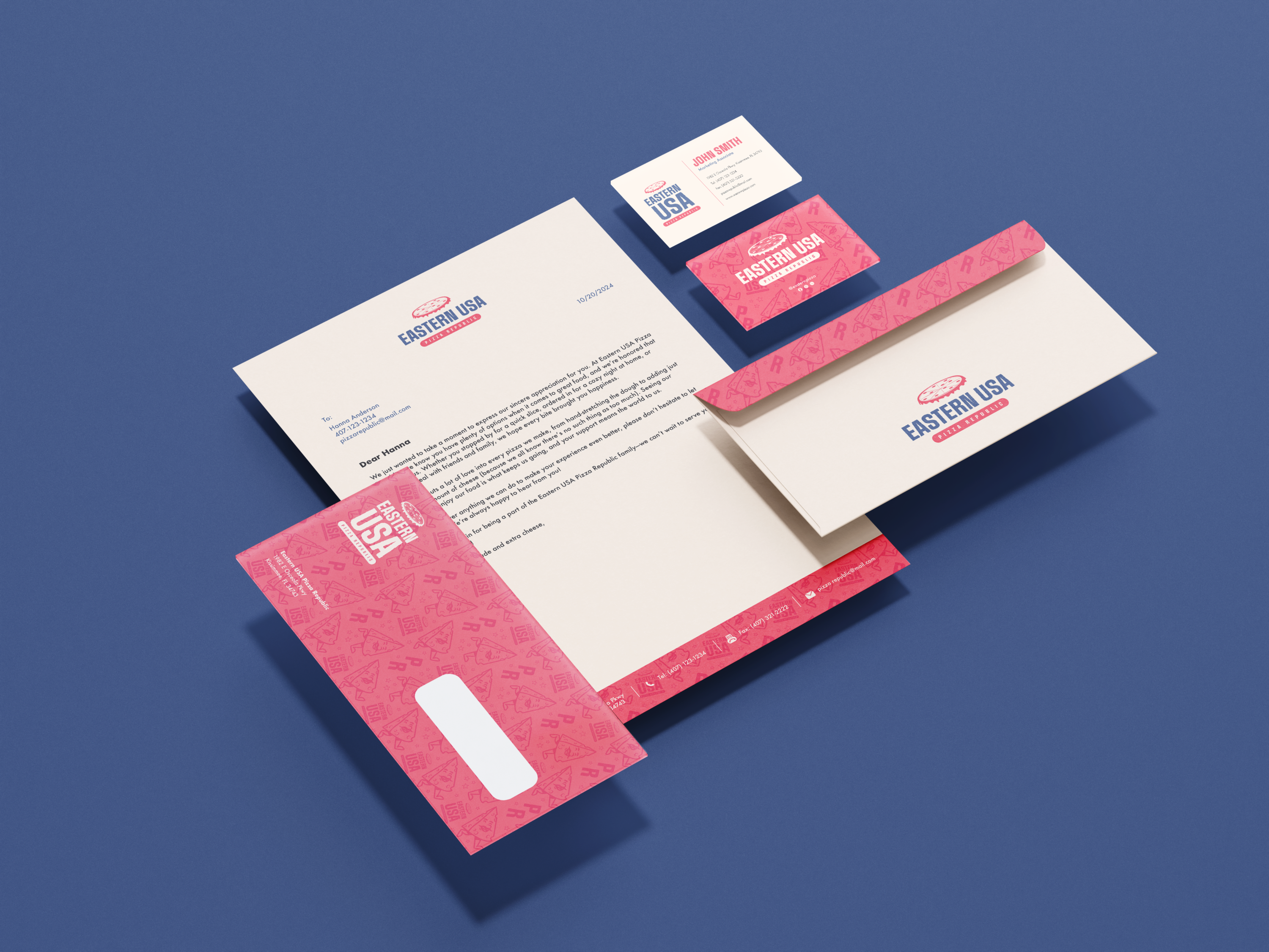
Stationery Package
The stationery package consists of a letterhead, a business card, and an envelope. All of these elements have a harmonious look by sharing similar structures, colors, and patterns.
The letterhead makes use of the beige color as the background; this neutral color gave us the opportunity to use the full-color logo and to add a red bar at the bottom to include, separate, and emphasize important information like the address and phone number. It was also decided to use the horizontal logo to leave more space for the contents of the letter.
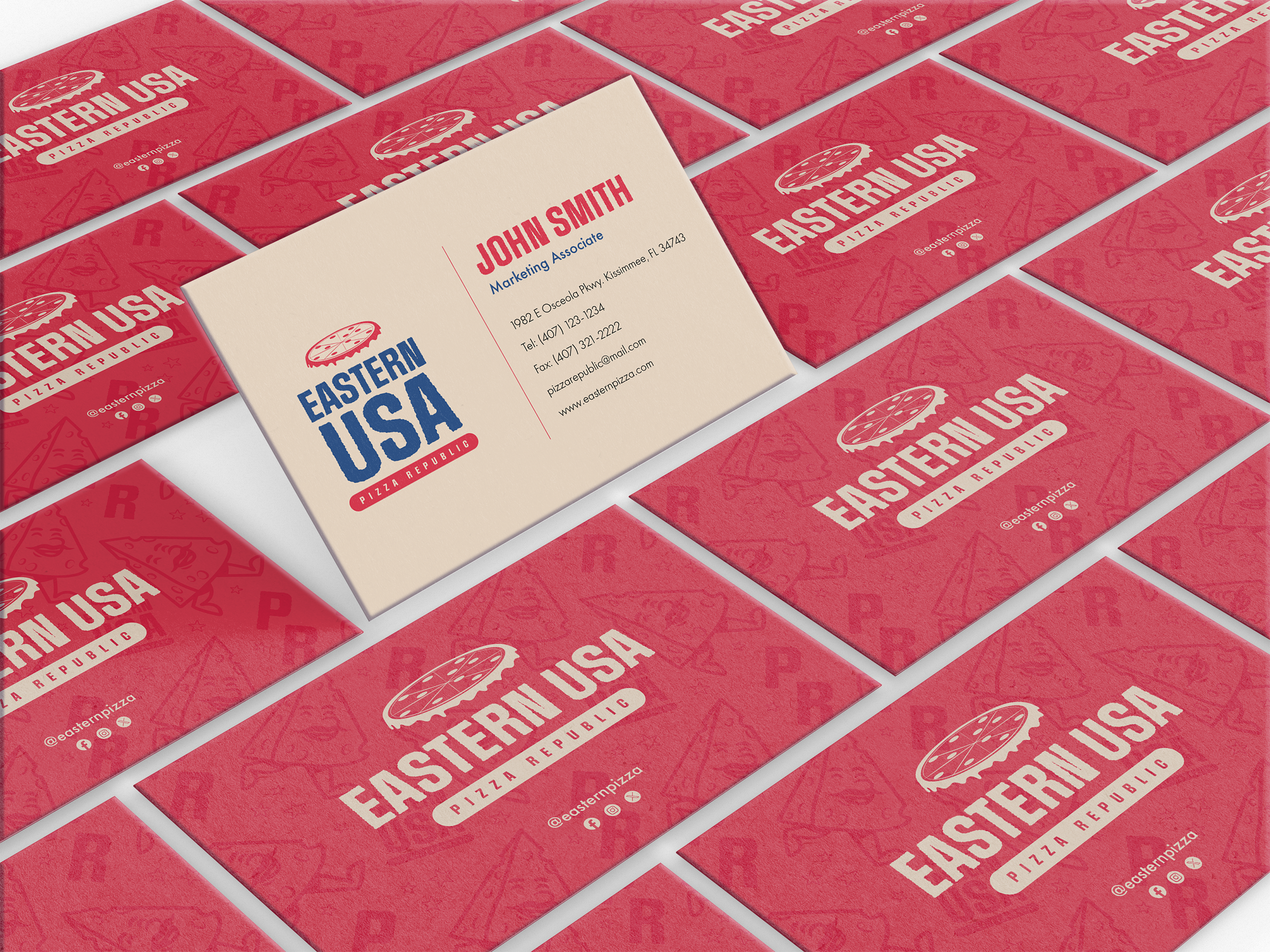
The business card was created using red and beige as background colors. This use of different colors on the two sides of the card helps create a distinction between the two sides and makes the overall look more dynamic. For this card, it was decided to use both the main and horizontal logos.
The envelope also uses different colors for the background, but in order to make the back part more interesting, it was decided to use the brand pattern for the flap and use the full-color logo.